lady with iPad

NEVER Say This Word to Users (Avoid Bias and Improve Your Research Data)

Picture this: you’re invited to a research study. The researcher greets you with a smile and says, “This is an interactive activity that will take about 20 minutes.” Sounds intriguing, right? Now, imagine instead they say, “You’re about to take a test.” Suddenly, your mind races. “What if I fail? What are they looking for? Am I about to be judged? Will I look stupid?” That tiny word—”test“—can flip a switch in your brain, and not in a good way. If your role involves gathering data from customers, this is crucial to think about.

How people wrongly use the word ‘test’

I see people using the word ‘test’ all the time, even those working as professional researchers. 

Pre-research: 

  • Recruitment: Customer emails to ‘Take part in our user test’. Be careful of your participant recruitment company too because those are often just admin staff who then promote your research to their database as ‘user testing’. 
  • Calendar invites sent to participants with the title ‘User test’ (note: this reads as though the user is being tested. If you really must use the word ‘test’, please please for the love of God at least refer to it as a website test, not a user test!)
  • Initial welcome: ’Are you here for the user test?’ (said by the receptionist or researcher).

During the research

  • Confidentiality form / NDA will often let slip a mention of user test. Sometimes these are written by legal so you’ll need to tell them to change the wording.
  • Introduction section of the research: The facilitator will say ‘thanks for agreeing to take part in our user testing’ or similar. 
  • Aiming to reassure: ‘This is not a test’ (just saying the word will prompt people to think of it as a test).
Image: This is not a test

Why Labels Matter (Hint: They Totally Do)

To find out why labels matter and how they affect us, lets quickly head back to 2004, when Ross and colleagues ran a fascinating study. They asked people to play a game that involved cooperation (or not). Half the participants were told it was called the “Wall Street Game,” and the rest were told it was the “Community Game.” The rules were exactly the same, but guess what? The “Wall Street” group acted way more competitively, while the “Community” group leaned into collaboration. Just changing the name to ‘Community’ made them behave in a more collaborative way.

Labels act like cues—subtle signals that shape how people think they’re supposed to behave. If you call something a “test,” you’re setting a tone of evaluation. And when people think they’re being judged, it’s game over for authentic responses. 

What Happens When You Say “Test”

You might think “test” is an innocent word. It’s not. Here’s what it does to your participants:

  1. Cranks Up Anxiety: “Test” screams, “You’re being judged!” and that makes people worry. Anxiety takes over, and instead of focusing on the task, they’re focused on not messing up.
  2. Triggers People-Pleasing Mode: Participants may try to give you the “right” answers instead of their honest thoughts. Spoiler: this isn’t great for your data.
  3. Activates a Fixed Mindset: Carol Dweck’s research shows that when people feel evaluated, they can get stuck in a “fixed mindset,” where they play it safe instead of trying something new.
  4. Sets Up Defensive Behaviours: A test feels like a challenge, and people might approach it like they’re protecting themselves rather than exploring freely.

Ditch “Test” for Friendlier Options

If you want participants to relax and engage, ditch the T-word. Here’s what you can say instead:

  • Swap out “test” for words like “research,” ”activity,” “feedback,” “game,” or “exercise.” Doesn’t that sound more fun already?
  • Frame it as exploratory: “We’re curious to see how people solve situations like this.”
  • Keep it collaborative: “We’re exploring this together. There are no wrong answers.”

These tiny tweaks can work wonders. They tell participants: “You’re here to help us learn, not to be judged.”

How to Set the Right Tone in Your Study

Here are some tips to make sure you’re creating a participant-friendly experience:

  1. Test Your Labels (Pun Intended): Try out different phrases during your prep phase. Which one makes people feel most at ease? 
  2. Train Your Team: Make sure everyone on your research crew knows the drill—use non-judgemental, inviting language.
  3. Start Off Right: From your first email to the consent form, use words that spark interest and collaboration, not fear of failure.
  4. Avoid Fancy Jargon: Even “assessment” or “evaluation” can sound intimidating. Keep it simple and warm.

Why It’s Worth the Effort

Here’s the deal: your goal as a researcher is to understand how people think and behave in the real world. But if your participants feel like they’re under a microscope, their behaviour changes. By being mindful of the language you use, you can create an environment where people feel comfortable being themselves. And that means better, richer data for you.

So, the next time you’re setting up a study, think twice before using the word “test.” A little tweak in your phrasing can make a big difference to how your participants feel and the data you collect.

References

  • Ross, L., Greene, D., & House, P. (2004). The “Wall Street Game” versus “Community Game”: Situational labels shape decision-making in social dilemmas. Journal of Personality and Social Psychology, 87(1), 1–13.
  • Dweck, C. S. (2006). Mindset: The New Psychology of Success. Random House.
  • Kahneman, D. (2011). Thinking, Fast and Slow. Farrar, Straus and Giroux.
  • Schwarz, N. (1999). Self-reports: How the questions shape the answers. American Psychologist, 54(2), 93–105.

Day 1 UXmas Psychology: Mental Loads

Imagine you’re using the Government website for the first time to file your tax return. You have to remember important information, take care to not make any errors, make sure you pay the correct amount and submit everything correctly. As you do this, there are things you’re thinking about (cognitive), things you’re looking at on the website (visual) and things you’re physically doing like typing on the keyboard and using the mouse (motor). 

These are what we call loads.

Loads

There are three loads in total (cognitive, visual and motor) and you might assume they’re equally weighted, but they’re not. Each one uses a different amount of mental resources, in this order:

1 Cognitive

People use the most mental resources if they’re asked to remember something or perform a mental calculation.

2 Visual

Looking at something on a screen uses more mental resources than motor but isn’t as demanding as needing to think about the task.

3 Motor

Motor is the least demanding load as most movements are performed instinctively, without us needing to think about what we’re doing.

Do everything in 3 clicks?

If you work in UX or as a designer, someone at some stage has no doubt advised you that everything should be possible to do in 3 clicks. I’ve no idea which genius came up with this theory but I do know that it’s a load of rubbish. When designing a digital user experience, there are always trade-offs. If you have to add extra clicks but the trade-off is that the user doesn’t have to think as much and the user journey feels more logical, then those extra clicks are worth it. Adding clicks is less of a load than thinking. I’ve personally seen this time and time again in the UX research and user testing that i’ve conducted over the years. As long as the experience is well thought out, logical and the pages are well structured, the number of clicks doesn’t matter. 

When motor loads are too much

Despite motor loads being the least effortful of loads, there are things that designers do that increase their effort. Many years ago I worked for one of the leading mobile brands and there were many times when I had to go back to the designers after user testing to tell them their hit areas and visual buttons were too small for people to press easily. The UI buttons would require multiple presses or a very accurate tip of the finger press to work, and people with long finger nails had absolutely no chance. What looks good on a large monitor often didn’t work well when it was shrunk down onto a small screen.

Sometimes you want to increase loads

Most of the time you’ll be looking to decrease loads to make your product easier to use, but there are times you may want to increase the load. For example you might add a video to a web page to deliberately draw the user’s attention to the product (visual load increased). The best example of purposefully increasing loads is in the gaming sector. In a game, there are quests that the user should find challenging to accomplish. Some games have high cognitive loads as the user has to work out what they need to do to make it to the next level. Some games have high visual loads, where users need to find things on the screen. Some have high motor loads, where users have to use a physical device to move around the game and interact with the characters onscreen. 

Key takeaways

  • Evaluate your existing website/app/product. Can you identify any opportunities to reduce any of the loads to make the experience easier?
  • Don’t make people think too much. When designing your product, try to reduce the cognitive load as much as you can. Don’t make people remember information that’s going to be too difficult for them to recall. Think how you can get around this, such as leaving the field optional or allowing them to complete this information later.
  • Where you can, look to reduce cognitive loads by increasing visual and motor loads. For example, rather than the user needing to read a full web page of information, a large clearly written call to action that draws them to the right place would be more effective.
  • Make sure that physical targets are large enough to be easily reached and easily pressed.

Interested in UX Psychology? Sign up to 24 FREE lessons in UX Psychology in my countdown to Christmas!

Lisa Duddington MSc, UX Consultant

Need UX research? PrestigeUX.com

Need users? INeedUsers.com

Warning: ANOTHER addictive game for designers

Following yesterday’s post on the most addictive game for designers, I’ve been informed that there is another hugely addictive game! Thanks to Peter Brooks for the recommendation.

In this game, you view a wireframe and type in the name of the website you believe it’s representing.

I apologise for your lost productivity these last two days.

Click the image below to begin…

http://dedesigntheweb.com/2.html

Warning: Most addictive game for designers

Get ready for the most addictive game you have ever played! Especially if you’re a designer or a UXer.

You’re going to have hours of fun with this one. Get ready for a decrease in productivity and an increase in competitiveness once everyone in your office gets their hands on this!

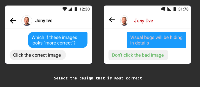
All you have to do is look at both images and click the one that you think is the correct visual design.

Click the image to begin…

https://cantunsee.space

Samsung Galaxy S8 Unboxing and Setup

I’ve been waiting AGES to get a new mobile. I had my heart set on the Samsung Note until it started exploding… I checked out the Pixel but wasn’t impressed by the hardware – it felt cheap and I didn’t like the back of it. I even considered the iPhone, after all I’m a loyal Apple customer, all my other devices are Apple so why not my phone too? But although I love the hardware of the iPhone, I’m just not overly impressed by what’s inside. It feels like they’re not pioneering in the mobile sphere as much as they used to. They’ve got a bit comfortable…

So, when I heard of the Samsung Galaxy S8, I tried not to get my hopes up too much. However, when I saw it in the Samsung Experience store I was suitably impressed.


Hardware

The hardware is NICEEEE! I’ll admit, I’m a hardware snob. What can I say, I used to work in mobile hardware so I’m now a bit fussy about good looking, high quality feeling devices. And boy, does the S8 feel high quality! Rounded edges, a good weight and classic shiny black finish that blends seamlessly into the infinity screen. Weight is important as a heavy phone is more likely to be dropped, whereas a light phone will psychologically feel cheap. It’s a fine balance.

The hardware keys are easy to locate by finger touch. However, the finger print scanner and the health sensors are very close to the camera lens. The topography of each is difficult to feel by touch alone so there’s a risk of getting finger prints over the lens if you’re not careful (although a case solves this).

I went for the S8 because I’ve been using a Note and I find it too big to use one-handed. It’s nice to mix things up a bit so I thought I’d drop down in size for this phone and maybe go up again after that. Using a bigger screen is a really nice experience, however because the screen in the S8 is tall and narrow as well as being edge-to-edge, the phone manages to be physically smaller but with a larger screen larger than bigger mobiles.


Galaxy-S8-and-S8-vs-Pixel-XL-vs-iPhone-7-Plus


Software, setup and user interface

The setup process was relatively easy. It took longer than I expected (and longer than it takes on iPhones), which was surprising because I’d already backed up my old phone ready for the transfer. There are a lot of steps and a lot of small print to accept.

There’s also a lot to remember.

Much of the setup process involves teaching you how to use the phone, including it’s many hidden gestures. This is both a positive and a negative. On the positive, it simplifies and cleans up the user interface as there are less onscreen buttons and commands required. On the negative, I’ve probably forgotten most of them already as there was a lot to take in (did you know our short term memories can only hold around 5-9 items for 15-30 seconds unless they’re repeated?).

The setup process teased me with the face recognition, iris scanner and fingerprint scanner as security measures, but it skipped the actual setup process of these which was odd. I had to go back into them afterwards and they are impressive! I’ve now setup all three but am currently using the face recognition. You do have to press the hardware key first to wake up the phone but then the process of scanning your face is almost instant. In the past, Samsung have been let down by gimmicky features that didn’t actually work very well in reality, but this is reliable, quick and cool. I love it!

The edge panel is a little disappointing. It’s one swipe access to your favourite apps, contacts or editing tools, however I don’t see the benefits, when you could just put your favourite apps on your Home screen, or you could just swipe up to see all your apps. It also covers the whole screen as opposed to just popping out from the edge. It feels like a step backwards from their previous designs of the edge. On the Note, the edge was something I used all the time to access my favourite apps because it’s always onscreen. On the S8 it doesn’t have that benefit. Instead, I’ve placed my fave apps on my Home screen as it feels easier to access than dragging in the apps from the edge (which often switches panels instead of bringing out the edge, so you need to be accurate).

Bixby is amazing! I love that I can take a photo or add an image and it will find me that item online. It will even translate languages. I’m looking forward to trying this when I visit Lisbon later this month – it should make translating menus really easy!

The camera is incredible in daylight and I’m really impressed with the background blur effect that you can get (who needs an SLR when you have an S8?!). However I tried both photos and video last night and they were both a little pixelated. In fact, I’d say my Note Edge was better for night time shots. I did just have it on the default mode so this may be improved if there is a night mode – I haven’t played around too much with the settings yet.

There’s a nice hardware shortcut that I discovered to get to the camera. Let’s face it, no one really carries a camera with them anymore because your phone is your camera these days, so why is the camera app always so cumbersome to access? Samsung have solved this by a simple double press of the Power key. It means there’s no need to look at the UI (which is a struggle on a sunny day), you can keep your eyes on the subject you want to photograph whilst you’re taking your mobile out and turning on the camera. THIS IS GREAT USER EXPERIENCE!

There’s so much more I could say but I’ll save that for another post once I’ve settled in with the S8 and used it a bit more.

So far, I’m really impressed. Sleek, high quality hardware and impressive features. It feels futuristic and I can’t wait to see what else it can do!

Is there anything you want to know or see of the S8?

Let me know and I’ll check it out for you.

Why people hate online passwords

Over christmas, I was sat with my stepdad as he opened up his new Kindle and attempted to set it up (a whole other usability story!). As it asked for his Amazon password he exclaimed how he didn’t have a clue what it was but he’d find out. The next thing I know, he’s opening up a spreadsheet on his laptop full of all his passwords! There must have been 20-30 of them. He said it’s the only way he can keep track of them all.

I was at a focus group recently where discussion naturally lead onto the topic of passwords. Every single person described how frustrated they are with the increasing pressure to create ever complex passwords that they then don’t remember.

It’s clearly a heated topic amongst users but with security being a top concern for companies (and rightly so), it puts ux designers in an awkward catch 22 situation. Make the password too complex and you risk people making the very un-secure decision of writing the thing down. Perhaps even putting it on a post-it by their computer – yes this happens! 

Anyway, as it’s Friday, let’s take a funny look at how this feels from the user’s perspective. I suspect most of you have also experienced this, haven’t you? 

Why people hate passwords

How guys will use Google Glasses (Project Glass)

I just had to share with you this video on how guys might use Google Glass (or should that be glasses?) in the future. Pretty funny! Maybe we shouldn’t laugh too soon though as it may well become the future! People are distracted enough as it is, it’s just that the glasses may make the distraction harder to detect. At least right now you can see if someone’s using their mobile whilst they’re supposed to be listening to you.

I find it amazing the number of people who walk down the street looking down, eyes glued to their handset, using only their peripheral vision to navigate their way through the world. At least with Google Glasses they’ll at least start looking up once more, even if they are still not paying attention to the world around them.

Information Architecture (IA)

Have you ever been to a website specifically to look for something and no matter how hard you look you just can’t find it? Most people will give up within a few seconds, hit the back button and go to a competitor. This is why your Information architecture is incredibly important – get it right and you will keep more people within your site, lowering your bounce rate and improving your conversion.

What is information architecture?

In simple terms, it’s about structuring your content to feel intuitive and logical to the end user.

An example of how not to do it

Tesco Direct have placed Halloween items within the heading ‘Christmas’ on the navigation bar. Users will struggle to find this as it makes no logical sense – halloween and christmas are completely separate occasions.

tesco ux usability

If a visitor to your website has the intention of browsing halloween things, they will already have expectations of where halloween things will be. Your aim is to try to understand their expectations of where they’ll find halloween related products. Only when you understand this, can you position it in the optimal place.

Card Sorting to create intuitive IA

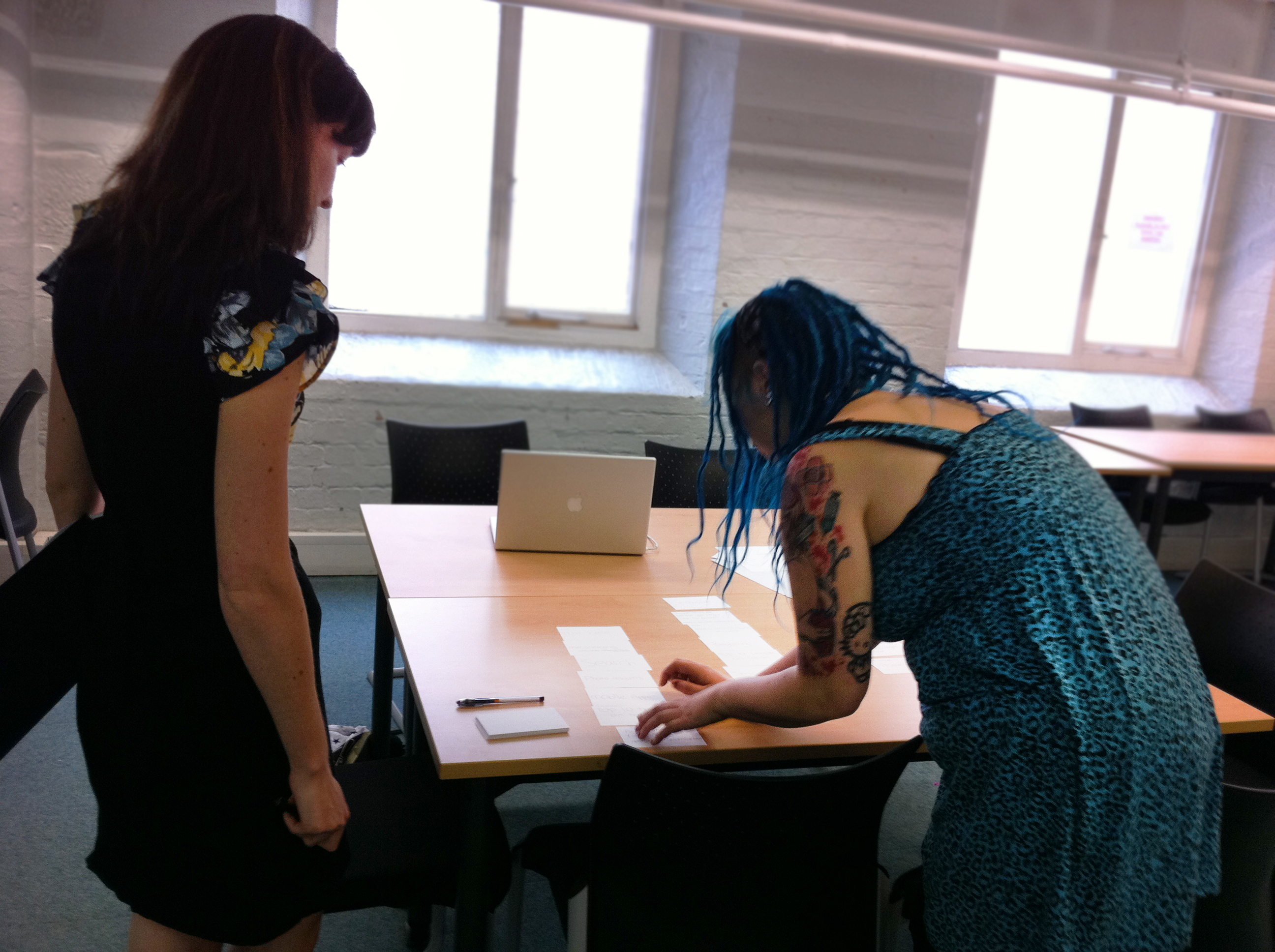
One of the methods I employ to help create intuitive Information Architecture is Card Sorting. It’s an activity carried out with users (i.e. your target audience) using labelled cards to group and organise pages of content. Users categorise the pages in the way that makes sense to them and they can use existing grouping or create their own. What this enables us to do is to see the structure of your site or software from the user’s point of view – we can see and understand their mental model.

Card sorting exercise in action:

card sorting with userIf you’d like to understand more about how reviewing your IA can help your business or if you’re curious about card sorting please don’t hesitate to get in touch.

user experience (ux) design and usability testing agency