Picture this: you’re invited to a research study. The researcher greets you with a smile and says, “This is an interactive activity that will take about 20 minutes.” Sounds intriguing, right? Now, imagine instead they say, “You’re about to take a test.” Suddenly, your mind races. “What if I fail? What are they looking for? Am I about to be judged? Will I look stupid?” That tiny word—”test“—can flip a switch in your brain, and not in a good way. If your role involves gathering data from customers, this is crucial to think about.
How people wrongly use the word ‘test’
I see people using the word ‘test’ all the time, even those working as professional researchers.
Pre-research:
- Recruitment: Customer emails to ‘Take part in our user test’. Be careful of your participant recruitment company too because those are often just admin staff who then promote your research to their database as ‘user testing’.
- Calendar invites sent to participants with the title ‘User test’ (note: this reads as though the user is being tested. If you really must use the word ‘test’, please please for the love of God at least refer to it as a website test, not a user test!)
- Initial welcome: ’Are you here for the user test?’ (said by the receptionist or researcher).
During the research
- Confidentiality form / NDA will often let slip a mention of user test. Sometimes these are written by legal so you’ll need to tell them to change the wording.
- Introduction section of the research: The facilitator will say ‘thanks for agreeing to take part in our user testing’ or similar.
- Aiming to reassure: ‘This is not a test’ (just saying the word will prompt people to think of it as a test).

Why Labels Matter (Hint: They Totally Do)
To find out why labels matter and how they affect us, lets quickly head back to 2004, when Ross and colleagues ran a fascinating study. They asked people to play a game that involved cooperation (or not). Half the participants were told it was called the “Wall Street Game,” and the rest were told it was the “Community Game.” The rules were exactly the same, but guess what? The “Wall Street” group acted way more competitively, while the “Community” group leaned into collaboration. Just changing the name to ‘Community’ made them behave in a more collaborative way.
Labels act like cues—subtle signals that shape how people think they’re supposed to behave. If you call something a “test,” you’re setting a tone of evaluation. And when people think they’re being judged, it’s game over for authentic responses.
What Happens When You Say “Test”
You might think “test” is an innocent word. It’s not. Here’s what it does to your participants:
- Cranks Up Anxiety: “Test” screams, “You’re being judged!” and that makes people worry. Anxiety takes over, and instead of focusing on the task, they’re focused on not messing up.
- Triggers People-Pleasing Mode: Participants may try to give you the “right” answers instead of their honest thoughts. Spoiler: this isn’t great for your data.
- Activates a Fixed Mindset: Carol Dweck’s research shows that when people feel evaluated, they can get stuck in a “fixed mindset,” where they play it safe instead of trying something new.
- Sets Up Defensive Behaviours: A test feels like a challenge, and people might approach it like they’re protecting themselves rather than exploring freely.
Ditch “Test” for Friendlier Options
If you want participants to relax and engage, ditch the T-word. Here’s what you can say instead:
- Swap out “test” for words like “research,” ”activity,” “feedback,” “game,” or “exercise.” Doesn’t that sound more fun already?
- Frame it as exploratory: “We’re curious to see how people solve situations like this.”
- Keep it collaborative: “We’re exploring this together. There are no wrong answers.”
These tiny tweaks can work wonders. They tell participants: “You’re here to help us learn, not to be judged.”
How to Set the Right Tone in Your Study
Here are some tips to make sure you’re creating a participant-friendly experience:
- Test Your Labels (Pun Intended): Try out different phrases during your prep phase. Which one makes people feel most at ease?
- Train Your Team: Make sure everyone on your research crew knows the drill—use non-judgemental, inviting language.
- Start Off Right: From your first email to the consent form, use words that spark interest and collaboration, not fear of failure.
- Avoid Fancy Jargon: Even “assessment” or “evaluation” can sound intimidating. Keep it simple and warm.
Why It’s Worth the Effort
Here’s the deal: your goal as a researcher is to understand how people think and behave in the real world. But if your participants feel like they’re under a microscope, their behaviour changes. By being mindful of the language you use, you can create an environment where people feel comfortable being themselves. And that means better, richer data for you.
So, the next time you’re setting up a study, think twice before using the word “test.” A little tweak in your phrasing can make a big difference to how your participants feel and the data you collect.

References
- Ross, L., Greene, D., & House, P. (2004). The “Wall Street Game” versus “Community Game”: Situational labels shape decision-making in social dilemmas. Journal of Personality and Social Psychology, 87(1), 1–13.
- Dweck, C. S. (2006). Mindset: The New Psychology of Success. Random House.
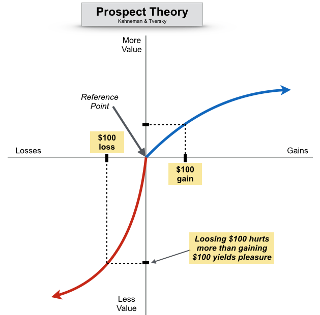
- Kahneman, D. (2011). Thinking, Fast and Slow. Farrar, Straus and Giroux.
- Schwarz, N. (1999). Self-reports: How the questions shape the answers. American Psychologist, 54(2), 93–105.