I’m in the news…

salford university carnival

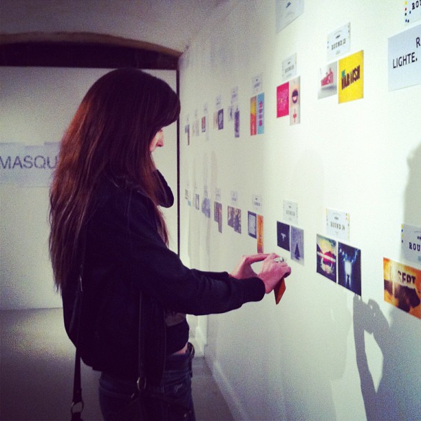
I’ve been featured on Creative Boom talking about the amazing Salford University Carnival held at Islington Mill this week. We had a great time! Below is an extract of the article and if you want to read more just head on over to Creative Boom.

Over a hundred Salford University graphic design students showcased their amazing work at Islington Mill yesterday in a fun carnival themed event organised in conjunction with Designers Northern Alliance.

Representatives from key Manchester and Salford agencies attended the event to inspire and look for the next generation of fresh talent. Keepitusable, Magnetic North, Design by Day, Eskimo Creative, and Code ComputerLove were just some of the industry experts to attend the event.

Lisa Duddington, co-founder of Keepitusable Salford’s first user experience design agency whose clients include the BBC, saw the event as a valuable opportunity to connect with and inspire the next generation of designers.

“It’s so exciting to be part of this event! We know how difficult it can be when you’re first starting your career, so we’re eager to help students and graduates to gain the valuable experience and knowledge they need to succeed in what is an incredibly competitive industry.

We have a fantastic relationship with Salford University and are proud to be able to offer both their students and graduates incredible opportunities to gain industry experience.”

An incredibly TAX ing User Experience

“Tax doesn’t have to be taxing”

completing tax return hmrcI can confirm this is the biggest whopper i’ve ever heard. Maybe it’s true if you never touch self assessment yourself and leave everything in the hands of bookkeepers and accountants. But, for the average Joe Bloggs, completing a self assessment for the first time (like I’ve just done) is a very unpleasant, frustrating and stressful user experience.

Completing a self assessment for the first time will:

  • Take much longer than you expect (take a guess then multiply it by at least 5)
  • Confuse the life out of you. The guidelines are so generalised that finding specific answers for your particular situation is nearly impossible.
  • Make you hate the HMRC helpline. They take a lifetime to answer the phone, and you can guarantee that as soon as you hang up the phone you think of one more vital question you should have asked so you have to start the whole process once again.
  • Make you hate all websites associated with tax, in particular the HMRC one. There’s a wealth of information out there but trying to find answers to seemingly simple questions like how to calculate how much NI you owe is very difficult as once again it depends on your particular situation.
  • Make you incredibly fearful of ‘Submit’ buttons.
  • Suddenly make you religious. In your head you’ll find yourself subconsciously saying a little prayer to the Gods of software and internet that your return is submitted successfully.
  • Make you hate Error messages even more than usual.
  • Start treating your computer like a precious object. No one is allowed within a two metre radius of it until the self assessment has been submitted. Each entry and mouse press is taken with extra care to prevent any mistakes being made.
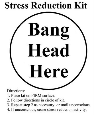
frustrated kit

My expectations of the online user experience for completing your self assessment were that it would be easy. After all I’d seen the adverts on TV and the posters all over in the past claiming ‘Tax doesn’t have to be taxing’. My expectations couldn’t have been more wrong! Firstly I logged into the website using my login details and as I’d already told them I was a partnership I was expecting some kind of wizard to take me through the whole process online. But I couldn’t see any call-to-actions to say ‘Begin here!’ so I found myself aimlessly clicking on every hyperlink I could find. I just couldn’t find the starting point. I felt like Sarah in the movie Labyrinth who can’t work out how to get into the labyrinth.

So I went to my old pal Google. After some time I found an article that mentioned needing software to submit a partnership tax return. This was all a bit odd, I thought you could just use the HMRC site. Anyway it turns out you need to purchase software to submit a partnership return which is why there wasn’t a clear starting point on the website. I wish they’d explained this in big text as soon as I logged in. The site is very much aimed at people who have completed a previous self assessment and know what they’re doing.

I then had the task of trawling through lots of software websites and downloading demos to find something easy to use. This took time… Most were really, really bad. I’m so surprised that something everyone has to do can be made so complex. I’m educated up to MSc level, good with computers and I often have to understand complex problems so I can’t imagine how bad it must be for more novice users.

I finally decided on FTAX as it was basically a pdf version of the actual form. It looked more familiar and it had some intelligence – when you completed fields it automatically calculated other fields. It was still an unpleasant experience. The form started having what looked like a fit at one stage and would not stay on the page I wanted at all. Bear in mind I was feeling quite stressed at this point. The form was obviously evil and deliberately trying to wind me up even more. It wouldn’t behave itself until the following day and I then managed to complete all the fields.

Finally, I plucked up the courage to press the Submit button. It didn’t work. No response whatsoever. More stress. My partner tried it on his machine and hooray it worked! But oh no it failed! Errors written in the worst possible technical language imaginable beamed at me from the screen, giving me their equivalent of the middle finger. After a few attempts at tweaking random things I’m relieved to say that the form did eventually submit itself. Hooray! I can’t wait to go through it all again next year, not. I’ll definitely be employing an accountant next time because as i’ve found out tax IS incredibly taxing and should be left to the professionals until HMRC employ user experience designers to completely redesign the whole software!
Badly designed road layout

Take a look at the following road layout. Can you spot what’s wrong with it?

badly designed road layout

As this photo was taken at Media City, Manchester, UK, what’s clearly wrong with this is the entrance and exit are on the completely wrong sides! In the UK, it is the law to drive on the left side of the road. Needless to say, when turning into this car park, absolutely everyone drives in using the left side of the road. This is because the brain has built up an existing schema or map of how to drive and what to expect so it takes shortcuts where it can to avoid unnecessary processing. When we’re used to driving on the left side and entering car parks on the left side, we don’t look for or consciously notice road signs that might tell us something different. So the Stop road marking (which is upside down anyway to the driver so would be too difficult to read) and the arrow pointing to the right wouldn’t be noticed by the driver.

Surprisingly, Media City is a very new development so this car park was only created a maximum of a year ago. It’s slightly ironic when you consider that Media City is the new home of the BBC who place high importance on accessibility.

This car park has all the makings of an accident just waiting to happen.

There is also another thing wrong with the design of this car park that isn’t shown in the photo. Basically, this car park is right outside the Booths supermarket. So, if you are specifically coming to Media City to shop at Booths and you see this large enticing car park right in front of the store with an obvious road leading to it you will turn into it as it’s the only visible road into the car park. This road actually is one way, and it’s an exit road not an entrance road! So if you drive down this road you are going the wrong way! They’ve actually designed it as a one way system that involves driving quite a distance past Booths then taking two left turns. It’s completely unintuitive to drive past the store and the car park, which is why so many people make the unintentional mistake of using this road as the main entrance to the Booths car park.

The magic of mince pies

I stayed up last night to make a batch of my famous luxury mince pies to deliver to our Keepitusable clients today. They really are gorgeous mince pies that take me hours to make! I believe that personal little touches like this are what makes a business (or freelancer) stand out from the rest. 

Magic mince pies

Clients are just people at the end of the day and who doesn’t like to feel that someone has made a special effort for them. We’ve already given our clients Keepitusable christmas cards and big boxes of chocolates earlier this month, so the mince pies are a totally unexpected little extra touch to show that we appreciate their business and care about making them happy.

This is one of the many reasons people enjoy working with us and I thought I’d just take a moment to encourage you to think of your own clients and what you could do to make them love you a little bit more.

11 Free User Experience Books

Thanks to The UX Bookmark for this great list of free online user experience books!
1.   Search User Interfaces– by Marti A. Hearst
2.   Web Style Guide– by Patrick J. Lynch and Sarah Horton
3.   Designing Interfaces– by Jenifer Tidwell (Most of the book is available online, not all of it, as pointed out by Amanda)
4.   Designing Mobile Interfaces– by Steven Hoober and Eric Berkman
5.   The Psychology of Menu Selection: Designing Cognitive Control at the Human/Computer Interface- by Kent L. Norman 
8.   Building accessible websites– by Joe Clark
9.   Introduction to Metadata – by Tony Gill, Anne J. Gilliland, Maureen Whalen, and Mary S. Woodley
11. Categories for the Description of Works of Art– by Murtha Baca and Patricia Harpring

Move Over Maslow! The Users’ Hierarchy of Needs

Back in 1943 a psychologist called Maslow published what he termed a ‘hierarchy of needs‘ that can be applied to every human being. At the bottom level are physiological needs that every human needs to exist, like shelter, food and water. At the very top are factors that contribute to a feeling of self-actualization, like morality and creativity. You can read more here. The triangle shape is deliberate, in that there are a much greater number of people at the physiological level and only a small number who reach self-actualization.

We can apply Maslow’s concept to the user and their experience of any product or service. Starting from a base of does the product or service perform at a basic functional level to the ideal of the user being so engaged that they lose all track of time and enter a state of flow

Take a look at the Users’ Hierarchy of Needs below and think about where your product or service fits. What actions are you taking to step up to the next level and improve your users’ experience?

users hierarchy of needs