Soddin’ useless error messages!

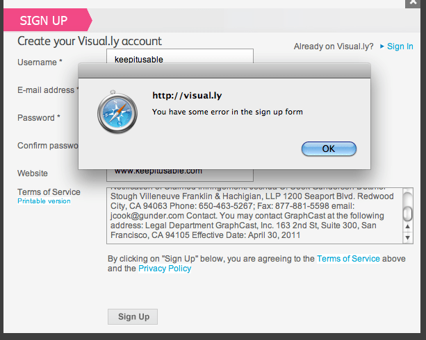
Seriously do some designers and developers think users are  mind readers? I’ve just tried to signup for visual.ly and believe i’ve filled out the form correctly, yet I continue to get this annoying and ridiculous ‘helpful’ dialogue:


Oh how useful! Jeez… I can tell you now that i’ve checked over the form and it looks ok to me, no obvious errors so I’m betting they have some tight password restrictions that they’re neglecting to inform the user about. Yep that’s right, there is no help or error text on the form when you go back to it. Not even a little red asterix anywhere to give you the teeniest of hints where you might need to focus your efforts. Needless to say i’m giving this one a miss. One less user for visual.ly due to poor error handling and total lack of help text.

Whilst i’m on the subject, here’s another lovely worded piece of error text. It’s so friendly, understanding and helpful (not!).


Referring to a person as ‘this user’ is never a good thing and you’re sure to annoy them by de-peronalising them in such a way. It’s also not helpful to say the number of errors. Why does that help the user to complete the form in any way?

It’s much better to be informative in a readable manner. Don’t be afraid to be informal – speak the user’s language. Lighten it up a bit, maybe you should even apologise so the pressure’s off them – it’s not that they made an error, it’s more than likely the form was poorly designed which caused the error in the first place.

Forms are generally boring. People hate having to fill them in. So why not ‘fun’ them up a bit. Try some of the following:

Use colour

Use informal language

Use transitions to make the form feel nicer to use

Think about whether you could add some funky graphics. Careful not to hinder the form usability though – it still needs to be focussed without anything distracting rather than contributing to completing the form.

Don’t forget to follow usability guidelines too! 

Apologise

Say what the error is AND how the user can fix it

Show the user which fields needs correcting. They should be visually different to the other fields.

– Put errors in place, rather than waiting for the user to press the ‘send’ button. Less pain, more gain!

Avoid technical language at all costs. Use words your audience will understand.

Try and keep the form itself short and painless too. Really think about the info you’re asking for. Cut it down, sleep on it and cut it down some more. Be ruthless! Form design isn’t easy and you should always perform usability testing on your form to ensure there’s nothing you’ve missed that could result in major drop-offs. Happy designing! 🙂
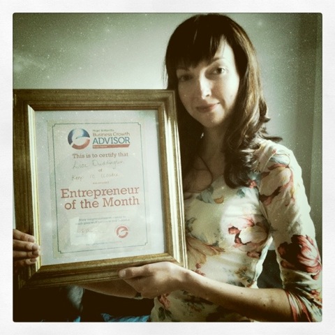
Usabilitygal wins Entrepreneur of the Month!

I’m not the type to boast (or ‘headwank’ as my ex-manager used to say!), indeed I left a local group recently as people were throwing their credentials around like a game of tennis to try and score points. I really can’t be doing with that, my passion is usability and design. However, I thought some of you may be interested to hear that I picked up the award for Entrepreneur of the month yesterday.

I’ve been working on several projects over the last 2 years. One I will hopefully be able to divulge the details of very soon! Another is keepitusable which I co-founded with my partner Ricardo in September last year. And more recently I setup catloves a fun site for people who want to enjoy browsing cute pics and vids of cats. Interestingly, I read in the telegraph yesterday that 1 in every 10 uk pets has a social network profile so I think catloves has got a good future ahead of it. People certainly love their animals!

Don’t worry I’ll be back to posting about usability very soon! In fact I started my next post yesterday, so be sure to pop by in the next few days!
usabilitygal x

Why coffee is the greatest addiction ever

I’m pretty sure that majority of you guys and gals are coffee lovers, right? Yeah, me too! Especially Whittard’s vanilla infused coffee… mmmm my mouth’s watering just thinking about it… anyway, don’t ever think of giving up the magical beans. This video proves just how great coffee is and why we need it!

What’s on my desk

Just for fun and because it’s a Sunday I thought i’d share with you what’s on my desk right now. Hope you find it interesting! Here we go:

Ramos

You’ve probably noticed the cat deliberately lying right in the way of me attempting to do any work (he’s still here now and i’m leaning over him to type this!). If he’s not on the table, he’s sat on my chair (literally as soon as my bum is off it, his bum is on it). It’s all some part of his grand scheme that no doubt encompasses opposable thumbs too…

iMac and MacBook

Yes i’m a Mac girl. They’re so much easier to use and last a hell of a lot longer than Windows machines. I used to go through a computer a year, seriously. Plus there would be lots of time wasted on trying to fix missing .DLL files, viruses, annoying random popups…

My MacBook which was my first Apple computer has now lasted about 3 years so although you may think they’re more expensive, in my opinion their reliability and longevity far outperforms other computers, which makes them the best value for money.

Moleskines

I’ve built up a number of Moleskines now, my latest being the red one on the right. I just love the way they lay open flat without you constantly having to fight them and bend the spine, as with other notebooks. If you’ve not heard of them they’re the notebooks that greats like van Gogh and Picasso used to use, the implication being that you’ll be as great as they were if you use Moleskines 😉 They really are quality frustration-free notebooks. Anything that aids the flow of creativity is a good thing in my opinion.

Oh thank God the cat’s finally moved to the side!

Starbucks mug and vanilla coffee

I find it really strange that people in the digital industry and geeks in general are forever going on about coffee on Twitter, blogs, their websites, etc. However here I am about to do the same! I swear coffee tastes better from a Starbucks mug – there’s satisfaction gained from the big handle and thick build quality. This mug would hands down beat other mugs in a fight! My favourite coffee is vanilla filter coffee from Whittards. It tastes only slightly of vanilla (not sweet, no sugar) and smells divine. Make this and suddenly everyone in the office will want to be your friend.

Cat Loves website

This is a site I created very recently just for fun because I love cats and wanted to try out some illustration work too. If it becomes popular that will be an added bonus so please share the link www.catloves.com if you know anyone who might enjoy browsing through all the cute cat pics and videos on there.

Cat ornament

I bought this whilst on holiday in Thailand several years ago now. I just think it’s cute 🙂 By the way if you’ve not been to Thailand, make sure you do at some point. It’s amazing!

Filing stuff

A trip to Ikea a couple of weeks ago, ended in purchasing these filing trays and stands. Actually I also bought this office chair (not in the picture) which is surprisingly comfy for only £59!

P.S This is where Ramos is now… it’s so considerate of him to move to the side so I can type.


Eye tracking – Should your website use it?

This week I’ve been visiting local usability labs that have eye tracking capabilities as we will soon be offering this added value service to our clients.

What is eye tracking?

Eye tracking uses non-intrusive technology to track where the user’s eyes are looking. It is often used for usability testing websites, software, mobiles, adverts, even shopping malls (there’s a lot of psychology that goes into where to place that can of Heinz!).

Testing involves the user using a website to perform tasks and is often accompanied by a satisfaction questionnaire. Afterwards, the users gaze path and fixations (basically what they looked at and for how long) can be watched and analysed. All the users data can also be combined into a heatmap so you can see which areas of each page attracted the most attention from users – did they even look at the big advert in the middle of your homepage?

Is it worth the extra time, effort and cost?

There’s a lot of disagreement amongst professionals as to whether eye tracking is worth the extra time and effort required to analyse the data and whether it really brings more value to usability testing. From speaking to those professionals that do use it, it is clear that businesses and in particular marketing departments are more persuaded and engaged by this testing method. Perhaps this is because marketing departments are more concerned about users noticing their promotions and advertising than finding out the hows and whys of users that visit their site.

I’m of the opinion that some websites are better suited to standard usability testing methods, some are better suited to eye tracking and others may benefit most from a mixture of both.

Video showing user’s scanpath
(the bigger the circle, the longer the user is looking at that point)

Video showing the use of heatmaps

Eye tracking is most useful when you want to test:

  • Page elements – To assess how much people notice ui elements onscreen, such as logos, promotions, calls-to-action, etc.
  • Navigation – To identify any conflicting terms as well as how different navigation layouts interact with each other.
  • Page layout – To show how a page layout and colour scheme affect the way users scan a page.

Eye tracking is least useful if you want to:

  • Gather user feedback – In order to generate an accurate heat map users can’t be asked too many questions as they’ll often look  away from the screen when answering questions.
  • Know why – Eye tracking will tell you what people look at and what they don’t look at but it won’t tell you why.
  • Test on a budget – Eye tracking is more expensive as it involves the hiring of technology and extra time to analyse the results. Stick with regular methods if you’re budget is limited.

I hope this basic introduction to eye tracking has been useful. If you are interested in seeing how real users actually use your website (with or without eye tracking) then give me a shout. You can observe the user testing in person (in the observation room) or we can stream the sessions live from the testing lab directly to your computer.

Secrets to successful attention

Everyone wants it. How can you make it work to your advantage? Read on…


The 10 minute rule

People’s ability to pay attention greatly decreases after 10 minutes. This is bad news if you’re a teacher or if you do a lot of presentations at work. However, what you can do is design your presentations with this rule in mind so that you do something at each 10 minute interval to re-engage your audience.


Multi-tasking is a myth

Did you know that we can’t actually multi-task? What actually happens is the brain switches between tasks in quick succession because it functions sequentially.

It’s more efficient and effective to do one thing at once

It takes you 50% longer to complete a task if it’s interrupted because the brain has to carry out four time consuming steps each time you switch tasks. Studies show that you’ll also make about four times more errors.


Sex, food and danger

When we were cavemen (and women!) life was hard so our brains learnt to respond to the 3 basic things that kept us alive. Sex ensured the continuation of our species. Acquiring food and avoiding danger kept us alive. Although we’re not cavemen anymore our brains still respond to these 3 stimuli. That’s why you see these constantly in adverts – brands play on these as they work on a subconscious level.

Why not think about the above and how you can apply them to your work to get more effective results and make more efficient use of your time.

30 excellent free ux tools

uxforthemasses.com have created a great list of 25 free ux tools for doing things like prototyping, annotating, screen grabbing, site mapping, usability testing, accessibility and analytics (thanks guys!). Some of the items aren’t really free (they just have a free trial), i’ve included them anyway as they’re still really useful and i’ve added a few of my own.

Prototyping tools

Pencil

LucidChart

Balsamiq

Serena

Flairbuilder (15 day free trial)

Powerpoint (Open office version is free)

Paper prototyping

Annotation tools

Protonotes

WebNotes

Diigo

Design tools

Lorem Ipsum Generator

ColorPic

Netvibes

Pen and paper! The simplest and arguably the best. Frees your mind to be creative, can be used anywhere and is ultra quick.

Screen grab tools

Jing

Firefox plugin

Browsershots

Evernote

Cmd shift 4 – If you’re using a mac you can use cmd shift 4 to capture a portion of the screen or cmd shift 3 to capture the whole screen.

Print screen – On Windows PCs you can just use the print screen function and paste it into Word, or Powerpoint if you want to do a click through prototype.

Sitemapping tools

XMind

Freemind

Usability testing tools

CamStudio

Remote usability testing tools

Usabilla

TreeJack

Skype

Loop11

Five second test

Silverback (free for 30 days)

Survey Monkey

Usability reviewing tools

Concept feedback

Analytics tools

Google analytics

ClickHeat

Accessibility tools

Accessibility evaluation toolbar

Total validator