New iPod Shuffle Usability

ipod-instructions

This weekend I managed to check out the new iPod shuffle in all its glory. I couldn’t believe how small it was! It seemed smaller than I expected. Almost too small. Very plain and simple, in just two colours; black and silver (disappointing for me as I prefer colourful iPods). What roused my interest was that the hardware contains just ONE button!!! It has three switch positions to either turn off, loop or shuffle tracks. All your other functions are accessed via a ‘+’, ‘-‘ and centre press on the headphone controls. Yep just THREE buttons! 

Of course it is lovely for the user to be given such a small array of buttons. It simplifies the experience, gives them less choice so less confusion (normally). I wish remote controls would take this approach more often!

The one thing that I found quite odd was the high positioning of the controls on the headphones wire. They are very high up. So high that you can’t look at them unless you take the headphones out of your ears. So you are really relying on your sense of touch to find and press the 3 controls. I didn’t think this was too difficult but it wasn’t as easy as I would expect, considering this is the only way to control the device. I felt these buttons could have benefited from some added tactile definition. Positioning the controls lower down the wire would have been ideal and meant less movement required by the user’s arm to change tracks, which would be most welcomed when exercising.

I did consider whether they would have been better placing skip tracks on the volume keys. So that, for example, short press changes volume and long press changes tracks. But I remember conducting a study in the past where users were very split on what short press and long press would do. It was very easy for them to confuse the functionality of volume and skipping tracks when placed on the same key. So I fully believe Apple have made the right choice to place these differing functions on separate keys.

So this is one iPod where I’m afraid you will need to read the instructions as the functionality is very hidden. I suspect quite a few people will at first try changing tracks by using the + and – buttons. Navigating track lists sounds tricky. In fact, I’ve just read it twice and have forgotten how to do it already. But to be honest, I think although skipping tracks by double and triple clicking is completely new and requires some cognitive effort and learning, it is actually surprisingly easy to remember. It also helps that fast forwarding and rewinding require the same number of clicks as skipping tracks – you just have to remember to hold down on the last click. In essence they are the same actions. 

Apple are renowned for their ease of use so this new Shuffle will receive a lot of attention and no doubt some negative press surrounding the fact that learning is required to use this product. But we must remember that more buttons do require more hardware space, and if buttons are important to you, go and buy the other Shuffle version. If a small size and sleek look is important then Apple are offering this compact version with the trade-off that it will require actually reading the instruction manual on this occasion. But as the manual is a page long, hey it’s no big deal really. Personally when I’m at the gym I like buttons so I’m sticking with my current Shuffle 🙂 But thanks Apple for giving us the choice!

The wonder of the Underground

For those of us not based in London, the Underground is a very strange and alien world that we have never experienced before. Having visited London many times, I am now used to the wonder and excitement of the Underground but for this article I will be casting my mind back to my first experiences and how bewildered I was by how staggeringly difficult the whole experience was. So let me take you on a journey…

Firstly, there are the masses of crowds, pushing you along, forcing you to go at a pace that as a newbie you really shouldn’t be going at. You want to stop before you get lost but you can’t so you slow down slightly, get pushed to the side and finally find a little space to get your map out. Back on your way you go. Now you get to a junction where you have to decide which line you need to take. So, you walk over to the large tube map on the wall looking for something large that shouts ‘YOU ARE HERE’ but there is nothing. You have no idea where the name of the place you are is in London so you don’t even know which vague area of the map you should begin to look for your starting point. You start looking in the centre, but you just cannot find where you are, nevermind where you want to go. So you look around for some help… in the north we are used to men in uniforms hovering about to guide you in the right direction…hmmm no such look here and all the passers by seem so pre-occupied and are rushing past you so quickly that you cannot ask them either. 

tube map

Back to the map. Suddenly a lady comes over, also looking at the map so you grab the opportunity to beg her to tell you where on the map you are, but unfortunately she is also trying to find her way and begins to complain about the map. All you want at this stage is a list of stations so you can choose where you want to get to and it will helpfully tell you which line and importantly which direction (oh yes we’ve all made that mistake!) you need to go in. 

You finally work out which line it is, yes the yellow one (it helps us visitors if you use this terminology rather than saying the name of the line). So you take the escalator, however, everyone strangely seems to know this alien rule to you which is you should stand to the right and if you don’t people will tut and push by you as if you’ve done the most horrid thing in the world. But hang on we’re in the UK, we overtake on the right not the left so where did this odd rule originate? 

escalator

You make it to the platform and you have never seen so many people in such a small space in all your life!!! You consider turning back but it is impossible, the exit is totally blocked with commuters and the person on the tannoy system is telling you to move further down the platform. There is NO going back. There is an odd musty smell which makes you feel uneasy but how cute! there are rats running around on the tracks! Eventually you make it onto a train after lots of pushing and watching someone get trapped by the doors – what is all that about? What is this weird world where doors open and close on their own within a matter of seconds? 

busy

Suddenly, I remember that I was told by some fellow UX Londoners not to touch or look at anyone. But I can’t help watching these people because they are so fascinating. It becomes apparent that they really do not look at each other! I also notice people who get on, read a book for literally 1 minute before getting off – what is the point? How much can you really take in in a minute? But everyone is doing it…

I finally make it to my destination and pop into a cafe to reflect on my experience. I realise I’ve not seen any wheelchairs or pushchairs on my travels. Is the tube accessible for these people? I didn’t notice any lifts at all. 

Now that I have been to London many times I have fallen into the trap of behaving in this strange manner myself. It is so easy to slide back into it. But it really is alien to the rest of the UK. The next time you see someone staring at the map or someone stood to the left not the right, just remember that it is your world, not theirs that is odd and you must forgive them until they learn the ways 😉

Please share your thoughts with me. I’d love to hear them!

Creative Designs (toxel.com)

Whilst drinking my morning coffee and carrying out my internet browse ritual, I came across a great site called toxel.com. This site is full of amazing real and concept creative products pulled from across the web into one place. If you’re looking for inspiration or just looking to be entertained by clever designs, this is the place for you.

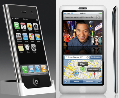
Being an Apple fanatic, my personal favourite is the ’10 Beautiful Apple iPhone Concept Designs’ page. The transparent phone looks awesome but still too large for my liking. One of the downsides of the iPhone for me is the grip it requires to use. As a woman with woman hands I find it too bulky to hold securely. If it had a smaller width or if it went on a diet to become a bit thinner, it would enable me to gain a more secure power grip on it, to use comfortably and confidently one-handed.

iphoneconcept

Personally I would go for either the ‘iPhone Concept from Japan’ or the ‘iPhone with ichat Concept’ because they look like phones that I could actually use but they are still cool and stylish. Importantly, the large screen size is also retained for watching videos and browsing the net.

phones

And if you missed it last year, take a look at these concept designs and watch the youtube video at the bottom of the page. Fun fun fun!

ccellp0

For all you fellow coffee lovers you must check out the ’24 Modern Mugs and Creative Mug Designs’ page. There are some amazing designs that are purely fun but also some really well thought out ergonomic designs too. I really like the Me cup:

The cup has empty chambers in its wall to prevent burns and to isolate the hot liquid. The cup comes with a saucer, which also has its role to play because it can be transformed in a lid to keep the heat inside and serves as a locking system to stack and store them on top of each other – Nice!!!

mug31

And finally, check out the ’14 Creative Advertisements’. There is great one by 3M who chose to advertise their unbreakable security glass by placing hundreds of dollar notes inside the glass at a bus stop. What a unique and brave idea! Well I thought so until I found out that:

‘Actually, it was only $500 of real currency stacked on top of fake money, and people could only use their feet to try to break it. A security guard was present to make sure no one broke the rules and that people couldn’t get to keep the money if they broke it’.

Suddenly their unbreakable glass is not sounding so unbreakable anymore…

creativeadvertising11

Show text visually with Wordle


Wordle result

The above image was created using a site called Wordle, that enables you to represent text in a more visual and fun way. I was able to type in the url of this blog to have a Wordle automatically generated.  After customising the font type and colours, within a few minutes I had created my first Wordle! The larger words are those which appear most frequently in the blog and because each Wordle is formed from different word sources, each one creates its own unique shape. What’s really interesting about these is the quick overview it provides – in just a few seconds you get a good feel for what my blog is about (and I can see which things I’ve harped on about the most so far).
    
Usability issues? Sure there were some:
– Menu lists stay open even when you try to select away from them.
– The screen seems to refresh a lot, causing an odd flashing effect when you scroll.
– Changing properties like the font type refreshes the Wordle, including it’s shape unfortunately. There is no way to say ‘I want to keep this exact shape but just change the font type’.
– No way to export your Wordle. I had to print screen to get it.
– No way to quickly go back to your list of words to add/edit them. You have to start all over again.
     
Wordle is still a relatively young site, so I’m sure they’ll get round to fixing some of these in the near future. It’s still easy, quick and fun to make your first Wordle. Have a go!

Palm Pre: First Thoughts


Today, thanks to the (not so) smartfilter being removed from my work laptop, I have been able to watch a great video on the new Palm Pre! Here are my first thoughts.

Hardware:

palm-pre

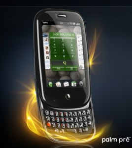
Pretty cool and sleek. Smaller than the iPhone with nice rounded edges. My guess is they have managed to keep the size down due to the 3mp camera (these are the major space eaters in mobiles). A capacitive touchscreen enables the use of gestures and multi-touch (ladies trim those fingernails if you want this phone). The slide-out qwerty keyboard distinguishes this from the iPhone giving peace of mind for those users who like  tactile feedback and the reassurance of physical hardware keys. The phone has a slight curve to it when the slider is open, which palm have marketed as ergonomic… I would say it looks nice but to claim that it is ergonomic? hmm…. 

UI:

The UI is very familiar (think iPhone). They have tried to keep all options hidden away to maximise what you see on the screen and declutter the interface. So within contacts there is just one nice big onscreen button to press to add a contact. Then when you select a contact there is a big edit button. Nice. You get the idea.

Surprisingly there is no option to ‘Save’ anything. I understand their reasoning for this and they believe this is a fantastic benefit, however, I know from observations in my previous user studies that ‘Save’ is important to users. We once changed this word to ‘Done’ and just that slight change caused users no end of problems. Saving is more about positive confirmation and peace of mind. We have been brought up in a world where you have to Save everything you do on a computer or a mobile, so it actually goes against the users’ mental model to not save. It will be very interesting to see how learnable this is – can we let go of this need to Save easily? 

Gestures and interaction:

Interaction with the phone requires a mixture of gestures and pressing the only key on the front of the phone (they call this the ‘Centre key’). It is in the exact same location as the iPhone’s home key and what do you think this button does? I’m guessing you’re thinking it must be the panic button that all phones have (AKA red/home key that takes you back to the home screen), the ‘argh! I’m lost, I’m off back to the beginning’ key. Well they have chosen to go against the industry standard and instead, use this key for multitasking. From what I can see on the demo, the only way to get back ‘Home’ is to use the back gesture. Alarm bells started to ring with me when the guy demonstrating this gesture says that to go back he flicks back “in the gesture area from right to left like I’m turning the page in a book”. Erm… hang on a minute…if you flick from right to left to turn a page you’re going forwards a page, not back to the previous page. It also feels easier and safer (more grip on the phone) to flick from left to right one-handed, using the thumb.

I quite like the swipe up gesture to get to the application menu. However, there is another swipe up gesture to get to your Wave dock (AKA Shortcuts) but with this gesture you have to make sure you drag slower and keep your finger on the screen until you have selected just underneath the item you want. This is quite a different interaction style to the rest of the phone as you aren’t selecting the item onscreen, rather, you are selecting just underneath the icon and it is when you lift your finger (deselect) that the selection activates (see the picture below, the white spot represents your finger). I think they may have been better combining the shortcuts with the application menu and visually make it clear that they are separate. Keep it simple guys. The Wave dock in action:

Shortcuts Menu - Drag up gesture

Other stuff:

Ok enough of the potential usability issues. Personally, I was really impressed with the Palm synergy functionality. This enables you to bring together all the information you have on a person from multiple places (Outlook, Facebook, Google) all into one place in your Contacts app. Simple! 

The calendar has a small but cool feature that I liked. It compresses any empty space so that you can see for example an appointment you have at 9am and one at 7pm all on the same screen (assuming you have nothing inbetween). 

The aggregated IM stuff sounds great, and how cool is it that you can start an IM chat with someone then when they go offline you can just change to texting them and it all shows in the same conversational messaging window! 

To conclude, we must congratulate Mr Palm Pre for doing a really decent effort as an iPhone competitor. I’m still going to keep my fingers crossed for an iPhone Nano though. Please Mr Jobs… please…