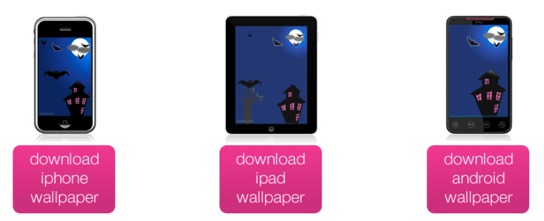
Happy halloween! Trick or treat you say? Ok then, here’s a great treat for you! It’s a fun, free spooky halloween wallpaper for your iPhone, iPad or Android mobile phone. I’ve got this on my Android Galaxy S and it looks fab! 🙂
Category: Design
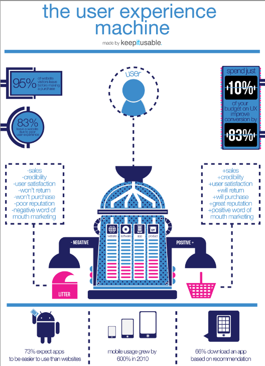
FREE amazing UX poster: the user experience machine
Keepitusable have produced a fab, fun and importantly, free ux poster as a very early little christmas present to you all. don’t worry, you don’t need to enter any personal details at all to download it, just click the image below then hit the big pink button to download your copy. alternatively, if you’d like a hard copy poster version to display by your desk, head over to their deviantART page.
FREE GUIDE How To Design: Login Forms
[tweetmeme source=”usabilitygal” only_single=false]
I’ve been hard at work this morning creating a guidelines document on how to design amazing, easy to use, login forms. It’s completely free for you to download. I hope you find it helpful. There is a useful checklist at the end which you can use as a quick reference for your designs.
If you like it then please feel free to pass it on to others. Together, we can make login forms easy to use!
Login Forms: The Good, The Bad and The Ugly
[tweetmeme source=”usabilitygal” only_single=false]
After reading 100 outstanding login forms, I was surprised just how bad a lot of login forms were in terms of usability! Do these people not want users to login to their sites? So i’m going to pick on a few of them and you’ll see what makes a login form good, bad and just downright ugly.
The Good
This is how it’s done guys. Why is this form so good?
- Clear title ‘Member Sign In’
- Clear labelling of username and password fields
- Nice big call-to-action ‘Sign in’ button.
- Button to ‘Register’ in case the user pressed sign in by mistake.
- Links for both forgotten username and forgotten password
- Clean page keeps the users focus on the task.
The Bad
Oh my! There’s pink and then there’s PINK! So, firstly this hurts your eyes doesn’t it? The smaller white text is also quite difficult to read because the pink overwhelms it, diluting the white so it actually looks like a light pink (poor readability). There is no help for if you have forgotten which email address you used to sign up to the site. There is no help if you have forgotten your password. There is no link to the sign up page. And if we’re going to be picky, we could point out the inconsistency between the way they have spelt ‘Login’ in the title, ‘log in’ on the first line and ‘Log-in’ on the button.
The Ugly
Oh dear! This doesn’t even look finished does it? There is no indication of what the user should type in which field. There is no help at all for forgotten login details or password. In fact there is no link to any kind of help at all! When we say ‘keep it simple, keep it usable’ we don’t mean to this extent!
What I noticed on a lot of the login forms was a lack of help for users who may have forgotten their username or the email address they used to sign up. There were plentiful links for forgotten passwords. These days users have multiple email addresses and usernames so it’s good practice to include help in your login form for if they forget which one they used.
Just another before you go…. The Confusing!
Hmmm can you work this one out? ‘Keep me logged in until I log out’. Isn’t this how sites normally work on the internet, i.e. you login to a site and you stay logged in until you press the logout button. So why is there a checkbox? Does this mean that if you don’t tick the box, when you press the logout button, you won’t actually be logged out?
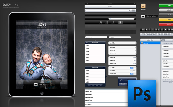
Start designing your iPad UI!
I just want to share this with you guys as it looks very useful for mocking up iPad UIs. It’s called the iPad GUI PSD, and can be downloaded and used in PhotoShop. Everything can be scaled easily as the elements are vector based. Thanks go to Teehan+Lax for this useful resource.
What is the optimal line length?
There isn’t one.
It depends on whether you want your users to read the page faster or you want them to like the page.
Research by Dyson (reference below) showed that users read web pages faster at an optimum length of 100 characters and longer. However, when asked, they prefer shorter line lengths and believe they read these faster (even though they don’t).
Dyson, M.C. (2004). “How Physical Text Layout Affects Reading from Screen.” Behavior & Information Technology, 23(6), pp. 377-393
Google – keeping it simple
Have you noticed that for some time now Google have been gradually adding more and more links to their homepage? This is typical ‘Feature creep‘ and unfortunately happens a lot.
Feature creep is when “extra features go beyond the basic function of the product and so can result in over-complication, or “featuritis”, rather than simple, design” (wikipaedia).
Google became the best search engine because of it’s simplicity. Think about it…what do you users really need on a search engine site? Strip it right back and all they actually need is a search box to type in and a button to press to get the results. They aren’t distracted by unnecessary clutter. They have one aim and they can perform it efficiently and effectively, achieving greater satisfaction.
However, even Google hasn’t managed to escape the dreaded ‘feature creep’. Recently it had begun to look like this:
Disappointing hey? The once simple site has become crowded with links.
BUT fear not! Google have recognised their featuritis and have tackled it head on with a rather ingenious solution. Now when you go to Google, it’s like going back in time to the old days when there was just a big search box and button. This is what you see:
Doesn’t it feel good? Very very simple. The cursor is positioned inside the search box so all the user needs to do is type and hit the return key or the search button. However, what about all the other features? Surely some of them were useful? Yes they were. Now for the clever part…. if the mouse is moved even slightly all the extra features fade in (via a nice transition). They are there if the user needs them.
Why does this work?
If the user wants to quickly search it is most likely they are poised ready to type as soon as the google page loads up. By positioning the cursor inside the search box, there is no need to touch the mouse. Users going to Google primarily to search have an excellent experience. Simple, fast and effective.
Users going to Google to do anything other than search will be used to having to use their mouse. Their existing mental model involves using the mouse. They may be slightly surprised upon seeing the new screen, but one tiny movement and the hidden features appear.
Search use case – keyboard focussed
Other use cases – mouse focussed
The new design provides a good fit between the interaction style of the user and the site behaviour.
Move Over Maslow! The Users’ Hierarchy of Needs
Back in 1943 a psychologist called Maslow published what he termed a ‘hierarchy of needs‘ that can be applied to every human being. At the bottom level are physiological needs that every human needs to exist, like shelter, food and water. At the very top are factors that contribute to a feeling of self-actualization, like morality and creativity. You can read more here. The triangle shape is deliberate, in that there are a much greater number of people at the physiological level and only a small number who reach self-actualization.
We can apply Maslow’s concept to the user and their experience of any product or service. Starting from a base of does the product or service perform at a basic functional level to the ideal of the user being so engaged that they lose all track of time and enter a state of flow.
Take a look at the Users’ Hierarchy of Needs below and think about where your product or service fits. What actions are you taking to step up to the next level and improve your users’ experience?

50% off the new Steve Krugg book!
Hey everyone!
I am really excited to have just seen on Amazon that Steve Krugg has a new book coming out on December 28th called ‘Rocket Surgery Made Easy‘. Don’t worry, it’s not actually about rocket surgery, rather it continues his usual theme of usability and user experience. As the title suggests, the book is all about making them easy to understand but this time with an emphasis on understanding and being able to conduct your own usability testing. If you haven’t read his book ‘Don’t Make Me Think‘, I would greatly urge you to do so as it’s certainly one of my favourite usability reads. His style is concise, informative and injected with down-to-earth humour and real life examples. The book is also filled with plenty of colourful examples to illustrate his points.
The RRP is £28.99, however on Amazon at the moment, their pre-order price is half that at £14.49. Amazing! Can’t wait to get my hands on a copy.

Free Human Centred Design Toolkit
I really love the word ‘Free’ don’t you? So as well as checking out the free online ‘Search User Interfaces‘ book by Marti A Hearst, make sure you also download your free Human Centred Design Toolkit!
The Toolkit, designed by the guys at Ideo, is divided into four sections:
The Introduction will give an overview of HCD and help you understand how it might be used alongside other methods.
Download the Intro Guide.pdf
The Hear guide will help your design team prepare for fieldwork and understand how to collect stories that will serve as insight and inspiration. Designing meaningful and innovative solutions that serve your customers begins with gaining deep empathy for their needs, hopes and aspirations for the future. The Hear booklet will equip the team with methodologies and tips for engaging people in their own contexts to delve beneath the surface.
Download the Hear Guide
The Field Guide and Aspirations cards are a complement to the Hear guide; these are the tools your team will take with them in order to conduct research.
Download the Field Guide
Download the Aspirations Cards
The Create guide will help your team work together in a workshop format to translate what you heard from people into frameworks, opportunities, solutions, and prototypes. During this phase, you will move from concrete to more abstract thinking in identifying themes and opportunities and back to the concrete with solutions and prototypes.
Download the Create Guide
The Deliver guide will help catapult the top ideas you have created toward implementation. The realization of solution includes rapid revenue and cost modeling, capability assessment, and implementation panning. The activities offered in this phase are meant to complement your organization’s existing implementation processes and may prompt adaptations to the way solutions are typically rolled out.
Download the Deliver Guide
Thanks to all the guys at Ideo for sharing this fantastic Toolkit with us.


