Day 1 UXmas Psychology: Mental Loads

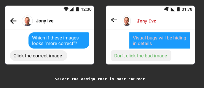
Imagine you’re using the Government website for the first time to file your tax return. You have to remember important information, take care to not make any errors, make sure you pay the correct amount and submit everything correctly. As you do this, there are things you’re thinking about (cognitive), things you’re looking at on the website (visual) and things you’re physically doing like typing on the keyboard and using the mouse (motor). 

These are what we call loads.

Loads

There are three loads in total (cognitive, visual and motor) and you might assume they’re equally weighted, but they’re not. Each one uses a different amount of mental resources, in this order:

1 Cognitive

People use the most mental resources if they’re asked to remember something or perform a mental calculation.

2 Visual

Looking at something on a screen uses more mental resources than motor but isn’t as demanding as needing to think about the task.

3 Motor

Motor is the least demanding load as most movements are performed instinctively, without us needing to think about what we’re doing.

Do everything in 3 clicks?

If you work in UX or as a designer, someone at some stage has no doubt advised you that everything should be possible to do in 3 clicks. I’ve no idea which genius came up with this theory but I do know that it’s a load of rubbish. When designing a digital user experience, there are always trade-offs. If you have to add extra clicks but the trade-off is that the user doesn’t have to think as much and the user journey feels more logical, then those extra clicks are worth it. Adding clicks is less of a load than thinking. I’ve personally seen this time and time again in the UX research and user testing that i’ve conducted over the years. As long as the experience is well thought out, logical and the pages are well structured, the number of clicks doesn’t matter. 

When motor loads are too much

Despite motor loads being the least effortful of loads, there are things that designers do that increase their effort. Many years ago I worked for one of the leading mobile brands and there were many times when I had to go back to the designers after user testing to tell them their hit areas and visual buttons were too small for people to press easily. The UI buttons would require multiple presses or a very accurate tip of the finger press to work, and people with long finger nails had absolutely no chance. What looks good on a large monitor often didn’t work well when it was shrunk down onto a small screen.

Sometimes you want to increase loads

Most of the time you’ll be looking to decrease loads to make your product easier to use, but there are times you may want to increase the load. For example you might add a video to a web page to deliberately draw the user’s attention to the product (visual load increased). The best example of purposefully increasing loads is in the gaming sector. In a game, there are quests that the user should find challenging to accomplish. Some games have high cognitive loads as the user has to work out what they need to do to make it to the next level. Some games have high visual loads, where users need to find things on the screen. Some have high motor loads, where users have to use a physical device to move around the game and interact with the characters onscreen. 

Key takeaways

  • Evaluate your existing website/app/product. Can you identify any opportunities to reduce any of the loads to make the experience easier?
  • Don’t make people think too much. When designing your product, try to reduce the cognitive load as much as you can. Don’t make people remember information that’s going to be too difficult for them to recall. Think how you can get around this, such as leaving the field optional or allowing them to complete this information later.
  • Where you can, look to reduce cognitive loads by increasing visual and motor loads. For example, rather than the user needing to read a full web page of information, a large clearly written call to action that draws them to the right place would be more effective.
  • Make sure that physical targets are large enough to be easily reached and easily pressed.

Interested in UX Psychology? Sign up to 24 FREE lessons in UX Psychology in my countdown to Christmas!

Lisa Duddington MSc, UX Consultant

Need UX research? PrestigeUX.com

Need users? INeedUsers.com

Warning: Most addictive game for designers

Get ready for the most addictive game you have ever played! Especially if you’re a designer or a UXer.

You’re going to have hours of fun with this one. Get ready for a decrease in productivity and an increase in competitiveness once everyone in your office gets their hands on this!

All you have to do is look at both images and click the one that you think is the correct visual design.

Click the image to begin…

https://cantunsee.space

Featured in the papers: Our award-winning health app

If you were reading the MEN newspaper on Saturday, you’ll have spotted me in an article about the mobile health app, Clintouch. The app was designed by Keep It Usable, and recently won an innovation award as well as being the subject of a meeting hosted by David Cameron’s senior health policy advisor at 10 Downing Street, to consider the impact that digital technology could have in improving the nation’s health.

Clintouch is one of the first apps being prescribed by doctors to patients to aid early intervention. Currently prescribed to patients with psychosis, the app could ultimately save the NHS millions by enabling earlier treatment before a patient becomes seriously ill.

The app asks mental health patients to record their mood using a simple, easy-to-use daily diary on their mobile. Patients can then see how their moods change and gives them the ability to be more in control of their illness. Also, if the app records a pattern or consistent low mood, their doctor is automatically alerted.

KIU-ClinTouch

To increase engagement and continued longer term use, the app was designed to be very easy to use. This is really important for anyone with mental health issues – the last thing they need is a frustrating to use or confusing app! Emotional engagement was also deemed important to aid longer term use, so we added personalisation features, such as the ability to choose a background photo or upload one of your own – something that will motivate the user. The app also contains motivational quotes and messages.

Cintouch is the creation of Manchester University and was thoroughly tested with psychosis patients. It is now being trialled in several NHS trusts with great success.

ClinTouch-Screens-Keep-It-Usable2

There is a great deal of scope for health and wellbeing apps to improve our lives, cut NHS costs and improve the relationships we have with our doctors. However, it is crucial that these apps are designed by professionals in collaboration with health experts so they actually work and have a high level of efficacy, otherwise they just join the thousands of health apps already in the app store that are downloaded and never used.

Independent research that we conducted with users of health and wellbeing apps showed that there is a great deal of distrust and disengagement with health apps (caused by the quality of apps in the marketplace at the moment). Users want trustworthy apps that are easy to use and will do what they claim to do. Clintouch is hopefully the first of many apps that bridge the gap between patient and doctor and make a real difference to both the NHS and people’s lives.

Read the newspaper article

Which do you remember? Computers of the past

Attending the Manchester Science Festival was incredible. Not only were there computers, mobiles and televisions from decades gone by, but they were all in full working condition, which meant I could re-live some of the highs (space invaders) and lows (error messages and recovery) of my first experiences with computers.

Did you have any of these computers? Did you play any of these games? Which was your favourite? Tweet me

BBC Micro: Chuckie Egg (1983)

I don’t remember this computer or Chuckie at all, but looking at the launch date of chuckie (1983) I was only a toddler so I’m pleased to say I’m too young to remember this one! Following Ricardo’s enthusiasm, I had a go at Chuckie and it was really difficult at first! Having to remember which letter or symbol did what took a bit of time to get the knack of, which is of course why UX is so important. But this game was great fun once I’d remembered the keys. I’d definitely play this. On another note, the tactile feedback from the keyboard felt hugely satisfying. You just don’t get deep key presses from modern day keyboards, and although it makes them slimmer and faster, you don’t get the cushiony, bouncy, weighty feel, which is really satisfying.

BBC Micro

Amiga – Lemmings (1985)

This is what I remember as our family computer. This and the ZX Spectrum. And I remember playing Lemmings all the time – I still think it’s one of the best games ever! But the game I used to play all the time was called Dungeon Master. Did anyone else play this? (please tweet me if you did!) The game started out in a chamber with portraits on the wall and you chose who you wanted in your team. Then you entered a maze and had to fight monsters, find food, complete tasks, find potions to make your way through the levels. I still remember my favourite character – he had a black cloak, red eyes and his name was Gothmog.

Commodore AMIGA

IBM

Ah these are the computers that we used at school. They never did what you told them to do and there were no end of hands going up in class for help with lost work, floppy disks that wouldn’t save, etc. And they took up the whole desk so you had to balance your school book on the edge of the table or on your lap. I don’t have particularly fond memories of this one!

IBM

Toshiba laptop

Toshiba Laptop

Oh no! It’s growing up with UI like this that drove me to get into usability. I remember constantly thinking, I know really clever people design and build technology, so why do they make them so difficult to use? Of course I know why now – if you’re too much an expert in something it’s difficult to look at things from a new users perspective. This error dialogue is a classic. Just look at the choice of colours used too – really poor readability on the command text at the bottom.

Toshiba Laptop Error

Floppy disks

There were lots of kids at the science festival and I wonder if any of them thought these were printed versions of the Save icon. I find it interesting that we’re still using this as a Save metaphor despite the fact that the true meaning is lost on many young people. However, they have learnt that it’s the Save icon, which begs the question should it really be updated or should it stay as a floppy disk, bearing in mind that although youngsters don’t understand what a floppy disk is, they do associate that icon with Save functionality. It’s a tough one.

Removable media

Other computers – do you know any of these?

Commodore 64

Dragon 32

Commodore PET

Macintosh

Google: Over 50% xmas enquiries will be mobile

Yesterday at the London e-commerce expo, Google’s Martijn Bertisen, spoke about e-commerce trends for 2015. Mobile is set to be BIG business and this christmas, over 50% of christmas retail enquiries are likely to come from smartphones. 2015 will be: The year that mobile takes over. The year of wearables – watch out for Google Glass. We’ll see this coming into the retail experience. Martijn said:

If there’s one message I wanted everybody to take away, it’s that what is increasingly enabling e-commerce is mobile devices. We’ve shifted from the desktop era into the mobile era and it’s still being underestimated… it’s where consumer behaviour is.

ux_advert

Why people hate online passwords

Over christmas, I was sat with my stepdad as he opened up his new Kindle and attempted to set it up (a whole other usability story!). As it asked for his Amazon password he exclaimed how he didn’t have a clue what it was but he’d find out. The next thing I know, he’s opening up a spreadsheet on his laptop full of all his passwords! There must have been 20-30 of them. He said it’s the only way he can keep track of them all.

I was at a focus group recently where discussion naturally lead onto the topic of passwords. Every single person described how frustrated they are with the increasing pressure to create ever complex passwords that they then don’t remember.

It’s clearly a heated topic amongst users but with security being a top concern for companies (and rightly so), it puts ux designers in an awkward catch 22 situation. Make the password too complex and you risk people making the very un-secure decision of writing the thing down. Perhaps even putting it on a post-it by their computer – yes this happens! 

Anyway, as it’s Friday, let’s take a funny look at how this feels from the user’s perspective. I suspect most of you have also experienced this, haven’t you? 

Why people hate passwords

Interview with Whirlpool’s UX Manager

kitchenaid uxIn my spare time I love baking (I love eating cakes), I run a local baking club and I absolutely love KitchenAid products. I love the industrial user-centred design and the attention to ease of use. So, for the Keep It Usable blog this month, I decided to interview my friend Brandon Satanek who is the UX manager at Whirlpool.

Not only is Brandon a great guy, but his knowledge and passion for UX is something you should learn from. If you’re unsure how UX can benefit your business, Brandon will reassure you with some fantastic examples. I especially like his example of how Whirlpool created innovative product concepts simply by sending their researchers into people’s homes to observe them doing their laundry and interviewing them.

After seeing people adopt rather uncomfortable postures, an idea was developed to create a platform to raise the products to a more convenient height…it shows how contextual user research can lead to user-centered innovations that directly impact the bottom line.

There are several names for this type of research; ethnographic, contextual inquiry, in-context. It’s my personal favourite style of research as you gain true insights into the user and their behaviour. Have you ever stepped into a strangers home and been able to make instant judgements on their personality, hobbies, interests, activity levels, family life that turned out to be accurate? Research has suggested that these judgements we make, which are based on our experience of life and people so far, are often accurate. If you’re interested to know more, I recommend reading Sam Gosling’s book Snoop: What your stuff says about you.

Many UXers shy away from contextual research as it is true research that requires a certain level of skill, and a lot of people who conduct usability testing aren’t specialist researchers.

Research conducted in the context of use is imho the best you can get. You will find out rich information and behavioural insights giving you those ‘why didn’t we think of that!’ moments that just can’t be gained through lab testing.

Read my interview with Brandon, it may just change your business…

Information Architecture (IA)

Have you ever been to a website specifically to look for something and no matter how hard you look you just can’t find it? Most people will give up within a few seconds, hit the back button and go to a competitor. This is why your Information architecture is incredibly important – get it right and you will keep more people within your site, lowering your bounce rate and improving your conversion.

What is information architecture?

In simple terms, it’s about structuring your content to feel intuitive and logical to the end user.

An example of how not to do it

Tesco Direct have placed Halloween items within the heading ‘Christmas’ on the navigation bar. Users will struggle to find this as it makes no logical sense – halloween and christmas are completely separate occasions.

tesco ux usability

If a visitor to your website has the intention of browsing halloween things, they will already have expectations of where halloween things will be. Your aim is to try to understand their expectations of where they’ll find halloween related products. Only when you understand this, can you position it in the optimal place.

Card Sorting to create intuitive IA

One of the methods I employ to help create intuitive Information Architecture is Card Sorting. It’s an activity carried out with users (i.e. your target audience) using labelled cards to group and organise pages of content. Users categorise the pages in the way that makes sense to them and they can use existing grouping or create their own. What this enables us to do is to see the structure of your site or software from the user’s point of view – we can see and understand their mental model.

Card sorting exercise in action:

card sorting with userIf you’d like to understand more about how reviewing your IA can help your business or if you’re curious about card sorting please don’t hesitate to get in touch.

user experience (ux) design and usability testing agency